LEARNING TASKS M5 LA 3
Instructions
Task 1: Understand the nature of Graphic
Organizers
A
GRAPHIC ORGANIZERS QUIZ.
Do the quiz.
Write a T at the end of each statement when you think the statement is TRUE; or an F when you think it is FALSE. One of them has been done for
you.
STATEMENTS
|
T/F
|
1
A graphic organizer is a visual display that demonstrates
relationships between facts, concepts or ideas.
|
T
|
2
Graphic organizer or GO is a term to describe all visual
learning strategies such as concept
mapping, webbing, mind mapping, and more.
|
T
|
3
GO is used to “map out” ideas using different structures
depending on the purpose of the task.
|
T
|
4
GO helps readers/listeners understand information more
quickly as they are forced to identify key information and chunk that
information into meaningful units;
|
T
|
5
GO presents more memorable information to
readers/listeners since relationships between various facts and ideas are
visually reinforced.
|
T
|
6
GO can be used as presentation tools to communicate
information.
|
T
|
7
GO is also a useful learning tool to help in note-taking
and planning presentations.
|
T
|
8
GO can serve different social function or communicative
purpose; e.g. to explain, to describe, or to show similarities and
differences.
|
T
|
9
Teachers can use GO to help present their teaching
materials to students.
|
T
|
10
Teachers can develop students’ visual literacy by
involving them in comprehending and presenting information in GOs.
|
T
|
Task 2: Understand the main
points of information presented in tables
Now, we will focus on exploring tables. This type of GOs is very popular to students and teachers. Therefore, it is necessary for you, as professional EFL teachers, to understand about how to comprehend and present information in tables.
What are tables? What is the purpose of presenting information in tables? How to read tables? How are information presented using them?
Tables are useful arrangement of data in rows and columns, or possibly in a more complex structure. Tables are widely used to organize information in communication, research, and data analysis.
A table can be read from left to right or from top to bottom. If we read a table across the row, we read the information from left to right. If we read a table down a column, we read the information from top to bottom.
The first row and first column in a table will have headers that help identify the information in the table.
Now, you know what is meant by tables. Next, read Text 1 below to find answer to the above questions. There are two exercises you need to complete based on your understanding of Text 1.
A table is a way of writing information in rows and
columns.
The table below shows the average temperature highs
and lows in Jamaica (measured in degrees centigrade) each month.
Month of the year
|
Average
daytime temperature 0C
|
Average
nighttime temperature 0C
|
January
|
30
|
19
|
February
|
29
|
20
|
March
|
30
|
21
|
April
|
31
|
21
|
May
|
31
|
22
|
June
|
32
|
23
|
July
|
32
|
23
|
August
|
33
|
27
|
September
|
32
|
23
|
October
|
32
|
23
|
November
|
31
|
22
|
December
|
31
|
21
|
Extracting information from tables
You could be asked questions about this table. To find answers
you should read along the row and down the column. Usually you’ll only need to
find the correct information in the table and give a report, although you could
be asked to make a calculation using information in the table.
Examples
Which month of
the year had the highest average daytime temperature in Jamaica?
¾ Reading down the Average daytime temperature column, you can
see that August has a temperature of 33°C.
What is the
difference between the highest average daytime temperature in December and the
lowest average nighttime temperature in December?
¾ Here you will need to find the row for December and look
across to get the lowest and highest temperatures for that month, then subtract
the lowest temperature from the highest temperature to find the difference: 31
– 21 = 10°C.
A. Do these exercise and quizzes to check your understanding of the table in text 1
1. Which month of the year has the lowest average nighttime temperature?Reading down the Average lowest temperature column, January has a temperature of 19°C
2. What is the highest average daytime temperature and the lowest average nighttime temperature for June?
Reading along the row for June, the Average highest temperature is 32C and the Average lowest temperature is 23°C.
3. Which four months has the same average highest daytime temperature of 31°C?
April, May, November, December have the same average highest daytime temperature of 31°C.
4. How many months have an average lowest nighttime temperature of 21°C? Name the months.
There are 3 Months which have an average lowest nighttime temperature of 21°C, i.e. March, April, and December.5. What is the difference between the highest average daytime temperature and the lowest average nighttime temperature in January?
The difference between the highest average daytime temperature and the lowest average nighttime temperature in January is 11°C difference.
[1] Modified from http://www.bbc.co.uk/skillswise/factsheet/ma36list-e3-f-introduction-to-lists-and-tables
LIST AND TABLE QUIZ
Level A
|
 |
Questions
|
Answers
|
Table
for questions no. 1-3
 |
|
1.
In the car expenses table, which of these is a row
heading?
A)
Petrol
B)
Car expenses Jan - March
C)
February
D)
£35.00
|
A)
Petrol
|
2.
What does the title of the table tell you?
A)
What the table is all about
B)
The months
C)
How much was spent on petrol in January
D)
What the key means
|
A) What the table is all about
|
3.
In the table, which of these is a column heading?
A)
Insurance
B)
Car expenses Jan-March
C)
£75.00
D)
March
|
D) March
|
Tables for questions no. 4-5
 |
|
4.
Look at this table. How much would 14 nights
accommodation at Tides Reach cost?
A)
£250
B)
£350
C)
£390
D)
£480
|
D) £480
|
5.
Which accommodation offers the better value per person for
a 7-night stay - Sea View or Tides Reach?
A)
Sea View
B)
Tides Reach
|
B) Tides Reach
|
Table for questions no. 6 -7
 |
|
6.
The table shows the average monthly temperatures for
Sydney. Australia. What is the highest average temperature?
A)
32°C
B)
33°C
C)
34°C
|
C) 34°C
|
7.
Which month has the lowest temperature?
A)
May
B)
June
C)
July
D)
August
|
C) July
|
Table for questions no. 8-10
 |
|
8. The table shows the summary data about events held over
a 2-year period. The total number of 1/2 day courses held is 36.
A)
True
B)
False
|
A) True
|
9.
From the table work out the total income earned from
conferences
A)
£25 590
B)
£41 302
C)
£66 892
|
C) £66 892
|
10.
From the table work out which type of event had the
highest attendance in Year 2
A)
1/2 -day course
B)
1-day course
C)
conferences
|
B) 1-day course
|
LIST AND TABLE QUIZ
Level B
|
 |
Questions
|
Answers
|
List for
questions no. 1-3
 |
|
1.
The café run by Friends of Nelson Hospital has the
following items on its menu for today. Edith orders a pizza slice and a cup
of tea. How much will it cost?
A)
£2.00
B)
£2.10
C)
£2.25
|
C) £2.10
|
2.
From the menu, which is the cheapest type of sandwich ?
A)
chicken and sweetcorn
B)
prawn mayonnaise
C)
cheese and tomato
|
C) Cheese and Tomato
|
3.
Mr Bose and his carer stop for a drink after an
appointment. Mr Bose orders a coffee and his carer has a soft drink. Will £1.50
cover the cost of both drinks?
A)
Yes
B)
No
|
B) No
|
Tables for questions
4 – 6
 |
|
4. Look at this table of
staff preferences for meetings. How many workers prefer meeting in the
afternoon?
A)
12
B)
13
C)
22
|
C) 22
|
5. From the table, which is the least popular day for a
staff meeting?
A)
Monday
B)
Tuesday
C)
Friday
|
A) Monday
|
6. Again, from the table, on which day of the week is at
least half the staff group available for meetings?
A)
Tuesday
B)
Wednesday
C)
Thursday
|
B) Wednesday
|
This table is for questions 7 & 8
 |
|
7. A company undertakes a survey to find out how its
employees' come to work. From the table can you work out how many employees
use more than 1 mode of public transport?
A)
5
B)
4
C)
3
|
A) 5
|
8.
Less than half the employees use cars or bikes
A)
True
B)
False
|
A) True
|
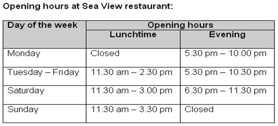
Table for questions no 9 -10
 |
|
9. Look at the table. On which evening is the restaurant
closed?
A)
Monday
B)
Tuesday
C)
Saturday
D)
Sunday
|
D) Sunday
|
10. What are the opening
hours on a Saturday evening?
A)
5.30 pm - 10.00 pm
B)
5.30 pm - 10.30 pm
C)
6.30 pm - 11.30 pm
D)
The restaurant is closed
|
C) 6.30 pm - 11.30 pm
|
LIST AND TABLE QUIZ
Level C
|
|
Questions
|
Answers
|
List for questions 1-4
 |
|
1.
Caroline needs to get to Stansted Airport by 10.45am
latest. Which of the scheduled trains will not get her there on time?
A)
The 9:55 and 10:10 trains
B)
The 10:10 and the 10:25
C)
The 9:55 and 10:25 trains
|
B) The 10:10 and the 10:25
|
2.
Which train is scheduled to takes longer than 47
minutes to get from Liverpool Street to Stansted Airport?
A)
09:25
B)
09:55
C)
09:40
|
C) 09: 40
|
3.
From the list, what is the frequency of train services
from Liverpool Street to Standsted Airport?
A)
every 20 minutes
B)
every 15 minutes
C)
every 10 minutes
|
B) every 15 minutes
|
4.
From the list, how many trains are leaving between
9.30am and 10.15am?
A)
5
B)
4
C)
3
|
C) 3
|
Table for questions no. 5 & 6
 |
|
5. Look at the table above. How much would three
toppings on a large pizza cost?
A)
£2.29
B)
£2.80
C)
£3.00
D)
£3.30
|
D) £3.30
|
6.
How much does a medium pizza with 2 toppings cost?
A)
£2.29
B)
£2.50
C)
£2.80
D)
£3.10
|
B) £2.50
|
Table for questions 7 & 8
 |
|
7. Pia has recently moved to New Town and is finding out
what's on offer at some local leisure centres. How many of these do not have
a swimming pool?
A)
1
B)
2
C)
3
|
B) 2
|
8. 7 leisure centres offer gym, swimming and steam/sauna
A)
True
B)
False
|
B) False
|
Table for questions 9 & 10
 |
|
9. Abraham Moss and Chorlton leisure centres offer the
most sports facilities.
A)
True
B)
False
|
A) True
|
10. 5 leisure centres offer both badminton and squash
A)
True
B)
False
|
A) True
|
B.
Study the following table
and do all the exercises that follow.
Country
|
Number of speakers of
English as a first language
|
Number of speakers of
English as an additional language
|
Total number of
English speakers
|
| The United States |
215,000,000
|
36,000,000
|
251,000,000
|
India
|
200,000
|
90,000,000
|
90,200,000
|
Nigeria
|
4,000,000
|
75,000,000
|
79,000,000
|
58,100,000
|
1,500,000
|
59,600,000
|
1
What is
the purpose of this table?
a.
To
explain changes over time in the number of English speakers among the
countries.
b.
To
present classifications of English speakers among the countries.
c.
To
describe the number of English speakers among the countries within two
categories.
Put the words into the correct form.
2
The
number of speakers of English as a first language (200,000) is particular
low.
3
The
number of speakers of English as an additional language, 36 million, is consider
higher than in the UK (only 1.5 million).
4
Here,
they are main speakers of English as an additional language (75
million out of 79 million).
5
The
number of speakers of English as a first language, four million, is strike
low compared to the 75 million who speak English as an additional language.
6
People
who speak English are large speaking it as a first language (215
million first language speakers out of a total of 251 million).
7
With
fewer than 60 million English speakers in total, there are notice fewer
speakers of English as an additional language than in the other three
countries.
Look back at the previous Table. Match each of the sentence
in the above exercise with a country in the table.
8
Sentence
1 à India
9
Sentence
2 à The
United States
10
Sentence
3 à Nigeria
11
Sentence
4 à Nigeria
12
Sentence
5 à The United States
13
Sentence
6 à The United Kingdom
Task 3: Understand the main
points of information presented in charts
A
Do these exercise and
quizzes to check your understanding of graphs and charts

Answer the following questions using the bar
chart above:
No
|
Questions
|
Answers
|
1
|
Who scored the
most goals?
|
Dimitar
|
2
|
How many goals
did Carlos score?
|
19
Goals
|
3
|
Which three
players scored ten goals?
|
Johan, Wayne, and Salomon
|
4
|
How many more
goals did Dimitar score than Didier?
|
9 Goals
|
5
|
How many
players scored more than 15 goals?
|
Two players (Carlos and Dimitar)
|
Graphs and Charts Quiz
Level A
|
|
Questions
|
Answers
|
Graph for questions 1-3.
Look at the graph of
monthly average temperatures recorded in Jamaica over a year.
 |
|
1.
1. Which month had the
highest average temperature?
A)
June
B)
July
C)
August
|
C) August
|
2. Which month had the lowest average temperature?
A)
January
B)
February
C)
March
|
B) February
|
3. April and May have the same average temperature as June
and July.
A)
True
B)
False
|
B. False
|
Chart for questions 4-6.
Look at the chart of car sales.
 |
|
4. Which make of car was the most popular?
A)
Nissan
B)
Vauxhall
C)
Peugeot
D)
Toyota
|
A) Nissan
|
5. Which 2 makes of car sold over 150 each?
A)
Toyota and MG Rover
B)
Toyota and Vauxhall
C)
Vauxhall and Peugeot
D)
Peugeot and MG Rover
|
C. Vauxhall adn Peugeot
|
6. Which was the lowest selling make?
A)
Land Rover
B)
BMW
C)
Jaguar
|
C. Jaguar
|
Text for questions 7 – 10
 |
|
7. Here's how I spent the past 24 hours? Match the table
and pie chart to find out what I spent the most time on.
A)
working
B)
sleeping
C)
getting dressed
|
A. Working
|
8. I spent more time on meals than travel and getting
dressed combined.
A)
True
B)
False
|
B) False
|
9. I spent less time
watching TV than on doing my household chores.
A)
True
B)
False
|
B. False
|
10. What did I spend the least amount of time doing?
A)
swimming
B)
getting dressed
C)
household chores
|
B. Getting dressed
|
Graphs and Charts Quiz
Level B
|
|
Questions
|
Answers
|
1. Choose the graph that
best fits with this statement: "House prices rose in January and
February, fell slightly in March and are now holding steady ".
 |
D.
 |
2.
Choose the graph that best fits with this statement:
"The TV licence has been frozen for the next 3 years".
 |
A.
 |
3. Choose the graph that
best fits with this statement: "This car has excellent
acceleration".
 |
C.
 |
4. Choose the graph that best fits with this statement:
"The price of groceries is still rising".
 |
B.
 |
Venn Diagram fro questions 5 – 8.
 |
|
5. Look at the Venn diagram. Which country is in the
United Kingdom but not in Great Britain?
A)
Northern Ireland
B)
Republic of Ireland
C)
Ireland
|
A) Northen Ireland
|
6. Look at the Venn diagram. How many countries are in
included in the United Kingdom?
A)
6
B)
5
C)
4
|
C) 4
|
7. From the Venn diagram, can you identify the 2 nations
that make up the british Isles?
A)
Great Britain and United Kingdom
B)
United Kingdom and Northern Ireland
C)
Republic of Ireland and Northern Ireland
D)
United Kingdom and the Republic of Ireland
|
A) Great Britain and
United Kingdom
|
8. Look at the Venn diagram. Northern Ireland is part of
Ireland as well as the United Kingdom.
A)
True
B)
False
|
A) True
|
Chart for questions 9 &10
 |
|
9. What service does the Council spend on the most?
A)
Cultural, Environmental and Planning Services
B)
Education Services
C)
Adult Community Care
|
C) Adult Community Care
|
10. What percentage of the Council's income is spent on Education?
A)
less than 15%
B)
more than on Children and Families
C)
less than on "other" services
|
B) More than on Children
and Families
|
Graphs and Charts Quiz
Level C
|
|
Questions
|
Answers
|
Bar Chart for questions no. 1-4
 |
|
| 1. We collected data about the colour of shoes worn by 30 adults in a group. From the bar chart, find the second most popular colour of shoes amongst men. A) Black B) Brown C) Red |
B) Brown
|
| 2. From the bar chart, find the second most popular colour of shoes amongst women. A) Black B) Brown C) Red |
C) Red
|
| 3. From the bar chart, how many adults wore white shoes? A) 1 B) 2 C) 3 |
B) 2
|
| 4. From the bar chart, find the total number of women who took part in the survey of shoe colours. A) 30 B) 17 C) 15 D) 13 |
D)13
|
Graph for questions 5 – 8.
 |
|
5. Which of these statements best describes what is shown
in the graph?
A)
The number of learners we’ve had in our college has
dropped significantly over the last five years
B)
There has been a small decrease in the number of
learners in our college over the last five years
C)
There has been no significant change in the number of
learners in the last five years
|
A) The number of learners we’ve had in our college has
dropped significantly over the last five years
|
| 6. From the graph, what was the decrease in the number of learners between Years 1 and 2? A) 10 B) 15 C) 20 |
B) 15
|
| 7. There was a small increase in numbers between Years 2 and 3 (see image above). A) True B) False |
A) True
|
| 8. Which of these statements best describes what is shown in the graph? A) The number of learners we’ve had in our college has dropped by over a 100 over the last five years. B) There has been a small increase in the number of learners in our college over the last five years. C) There has been no significant change in the number of learners in the last five years. |
C) There has been no significant change in the number of
learners in the last five years
|
Graph for questions 9 – 10
 |
|
9. The number of learners in year 1 was about…..
A)
600
B)
500
C)
550
|
C) 550
|
10. The number of learners in year 5 (see image above) was
about…..
A)
550
B)
499
C)
510
|
C) 510
|
Now, study this other bar chart carefully
to answer the questions listed below

Answering Questions
Questions
|
Answers
|
|
1
|
What does the chart provide information about?
|
The chart
provides the means of transport used by International visitor to New Zealand
during visit.
|
2
|
What is the commonest means of
transport? What percentage of visitors use it?
|
The commonest
means of transport is car with 69% use a car.
|
3
|
Which two means of transport are used
almost the same amount? What percentage of visitors use them?
|
Plane and
Coach are used almost the same amount with 32% of plane and 31% of coach.
|
4
|
What is the fourth most popular means
of transport? What percentage of visitors use it?
|
The fourth
most popular means of transport is Train with 20% visitors use it.
|
5
|
Which means of transport is used
least? What percentage of visitors use it?
|
Boat is used
least with 8% of visitors use it.
|
6
|
Overall, which is more popular:
private transport or public transport?
|
Private
transport is more popular tha public transport.
|
B. Line
and Pie Charts
Answer these questions based on the line chart that follows

|
|
No
|
Questions
|
Answers
|
1
|
What
information does the chart provide?
|
The chart provides the
information about monthly temperature of three cities for one year.
|
2
|
What is
the most possible purpose of the chart?
|
To describe temperature changes
of three cities in a year and to compare it with 3 cities.
|
3
|
Which
month has the highest average monthly temperature in the three cities? What
is the temperature height?
|
June is the highest average
monthly temperature in three cities and it is 340C.
|
4
|
Which month
has the lowest temperature in Cairo? What is the average temperature for
Singapore for the same month?
|
It is January in Cairo. It is
260C in Singapore
|
5
|
Which city
has the most extreme temperature difference throughout the year? What is the
minimum temperature? What is its highest one?
|
New Delhi has the most extreme
temperature difference throughout the year. The minimun temperature is 140C.
The highest one is 340C.
|
6
|
Which city
has the most stable temperature? What is the lowest temperature for this
city? When does it happen?
|
Singapore has the most stable
temperature. The lowest temperatue for this city is 260C. It
happens in January.
|
Answer these questions based on the pie chart that follows.
Match the questions in the right column with the best answer from the right
column.

|
The correct answer based on the pie chart above:
No
|
Questions
|
Answers
|
1
|
What is
the main reason for visiting New Zealand?
|
For holiday
|
2
|
What percentage of visitors go to New
Zealand to see friends and family?
|
29%
|
3
|
What does the figure 13% refer to?
|
the number of people who go to New Zealand
on business
|
4
|
What is meant by other on the chart?
|
other reasons
|
5
|
In general, do more people visit New
Zealand for work or pleasure?
|
for pleasure
|
Task 4:
Describing the main points of information presented in table and charts
A.The following line chart shows use of transport by international visitors during their visit in New Zealand. Can you complete the sentences in the following summary of the graph? Use the expressions in the box to help you.

a. going to museums
b. 50 percent
c. 85 percent
d. go to see places of interest/go sightseeing
|
e. 40 percent
f.
holiday activities preferred
g. 45 percent
h. people
|
The chart shows (1) holiday
activities preferred by international visitors in New Zealand. The most popular activity is
walking, which (2) 85
percent of people on holiday do. Seventy-five percent of
visitors (3) go to
see places of interest/go sightseeing and (4) 45 percent go to see
volcanoes. Another popular activity is boating, which (5) 50 percent of holidaymakers
do. Just over (6) 40
percent of visitors also like (7) going to museums.
Overall, (8) people enjoy
doing outdoor activities more than indoor activities.
|
B. Now,
try some more practice with the following charts and table.
No
|
Charts and Table
|
Summary of the charts or table description
|
1
|
 |
International Visitors to New Zeland: transport used during visit.
The chart gives information on the means of transport used by overseas visitors to travel in New Zealand. Nearly 70 percent of visitors travel around in New Zealand by car, which is the commonest mode of transport. The second and third most common ways of travelling in the country are by plane or coach, and just over 30 percent of visitors use each of these. By comparison, only 20 percent of visitors use trains. The least popular method of travel is boat, which six perce of travelers use. Overall, the chart shows that although cars are the most popular means of transport, more people use public transport than private transport.
|
2
|
 |
International Visitors to New Zeland: reason for visit
The chart gives information about people’s reasons for visiting New Zealand. The most popular reason for visiting New Zeland is 47% for holiday. Twenty nine percent of visitors come to New Zealand for visiting friends and relatives. Another reasons are 13 % for business trip and 11 % for others. Overall, the chart shows that mostly the visitors of New Zealand are tourists who spend their time there for holiday.
|
3
|
Percentage of passenger kilometres
by different modes of transport in Shanghai  |
Percentage of Passenger Kilometers by Different Modes
of Transport in Shanghai
The table predicts changes in the types of transport used in Shanghai between 1996 and 2020. The figures show that in 1996 the most popular form of transport was public bus, accounting for 39% of passenger kilometers. This was followed by bicycles with 27% whereas cars and scooters were used less, representing only 15% and 12% of passenger travel respectively. It is expected that in 2020 the use of cars will increase dramatically and account for over half of all distance travelled (52%). Bus journeys, for example, will only represent 22% of distances travelled, while bicycle trips will drop to as little as 3%, similar to the figure for walking. In addition, trains will probably account for 13% of passenger kilometers, while the use of all other means of transport will decrease. Predictably, walking made up the smallest percentage. Overall, the table predicts a massive increase in the use of cars by 2020, at the expense of other forms of transport.
|
sangat susah task ini ya..
ReplyDeleteSoal dan Jawaban Lengkap